with open(blue_path) as f:
header_line = f.readline().strip().split()
raman_shifts = [float(val) for val in header_line]
data = pd.read_csv(blue_path, sep=r"\s+", skiprows=1, header=None)
data = data.rename(columns={0: "x", 1: "y"})
# Rename intensity columns to match raman_shifts
intensity_columns = {i + 2: raman_shifts[i] for i in range(len(raman_shifts))}
data = data.rename(columns=intensity_columns)
# Crop to fingerprint + high-wavenumber region
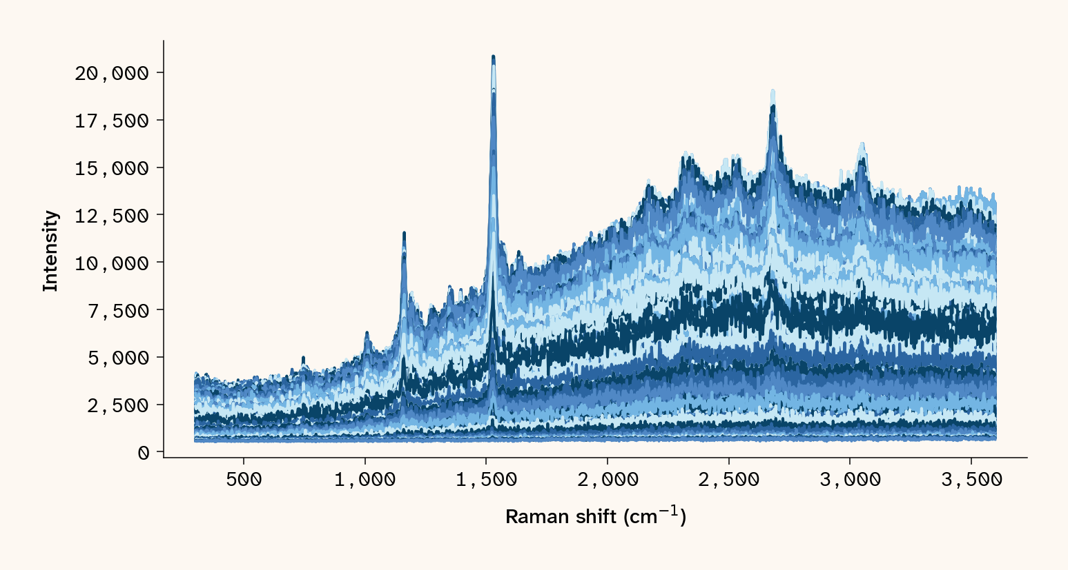
allowed_cols = [s for s in raman_shifts if 300 <= s <= 3600]
df_long = data.melt(
id_vars=["x", "y"], value_vars=allowed_cols, var_name="raman_shift", value_name="intensity"
)
df_long["raman_shift"] = df_long["raman_shift"].astype(float)
df_long["intensity"] = pd.to_numeric(df_long["intensity"], errors="coerce")
df_long = df_long.sort_values(by="raman_shift")
mean_spec = df_long.groupby("raman_shift", as_index=False)["intensity"].mean()
unique_shifts = sorted(df_long["raman_shift"].unique())
# Subsample to every 5th frame to keep the embedded notebook output under GitHub's 100 MB limit
unique_shifts = unique_shifts[::5]
# Convert colorscale once, not per frame, for performance
magma_colorscale = apc.gradients.magma.to_plotly_colorscale()
# Two-row figure: spatial map on top, mean spectrum below
fig = make_subplots(rows=2, cols=1, row_heights=[0.65, 0.35], vertical_spacing=0.15)
x_full = data["x"]
y_full = data["y"]
# Initial frame
init_shift = unique_shifts[0]
init_col = init_shift
intensity_init = data[init_col]
map_trace = go.Scatter(
x=x_full,
y=y_full,
mode="markers",
marker=dict(
size=10,
color=intensity_init,
colorscale=magma_colorscale,
colorbar=dict(title=dict(text="Intensity"), tickfont=dict(color="black")),
),
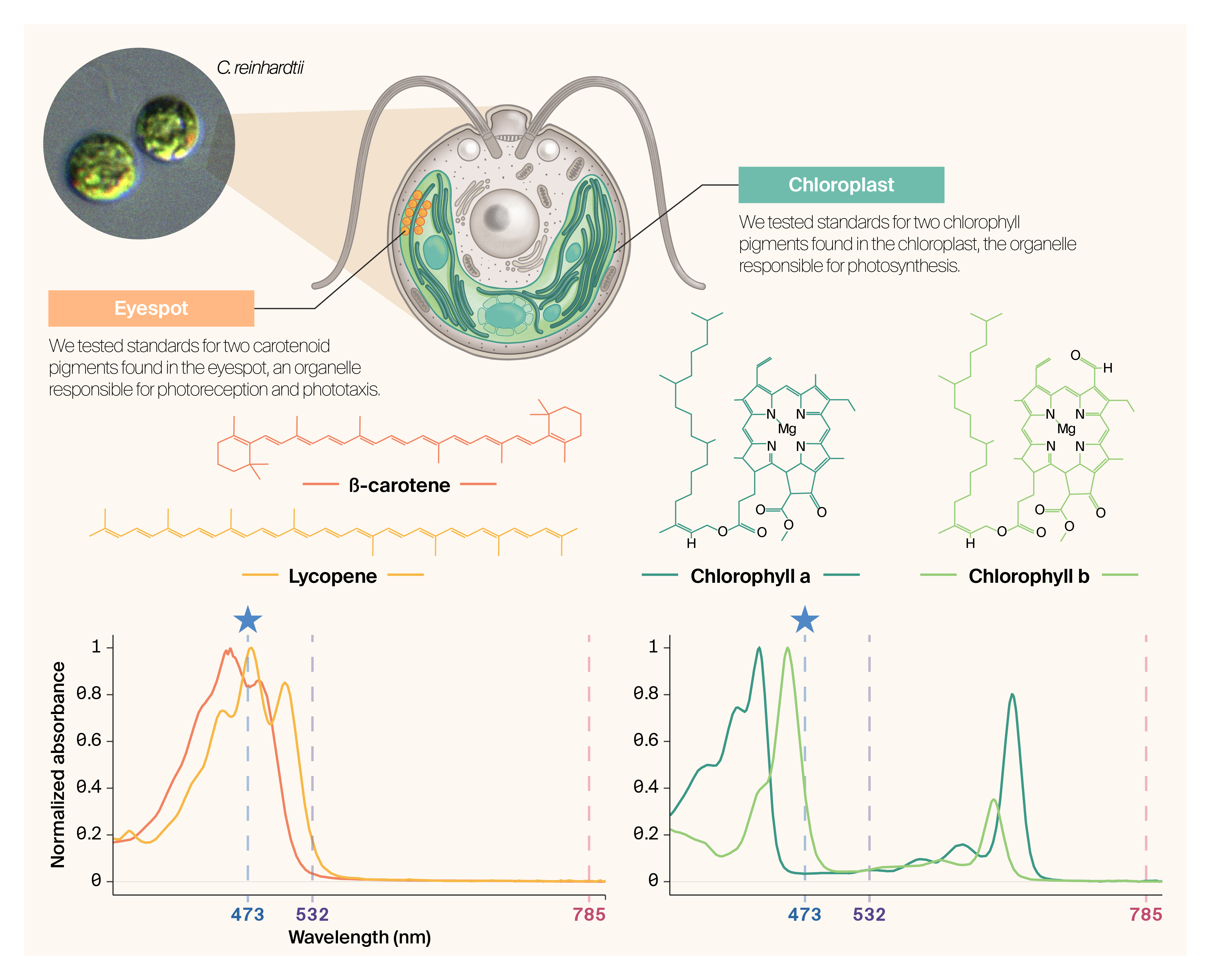
name="Spectral map of <i>Chlamydomonas</i> cells (473 nm)",
)
fig.add_trace(map_trace, row=1, col=1)
mean_trace = go.Scatter(
x=mean_spec["raman_shift"],
y=mean_spec["intensity"],
mode="lines",
line=dict(color="black"),
name="Mean spectrum",
)
fig.add_trace(mean_trace, row=2, col=1)
# Vertical indicator line on mean spectrum at current shift
if init_shift != 0:
init_line = dict(
type="line",
x0=init_shift,
x1=init_shift,
y0=mean_spec["intensity"].min(),
y1=mean_spec["intensity"].max(),
line=dict(color="black", width=2),
opacity=0.5,
xref="x2",
yref="y2",
)
fig.update_layout(shapes=[init_line])
# Animation frames
frames = []
for shift in unique_shifts:
intensity_vals = data[shift]
shapes_list = []
if shift != 0:
shapes_list = [
dict(
type="line",
x0=shift,
x1=shift,
y0=mean_spec["intensity"].min(),
y1=mean_spec["intensity"].max(),
line=dict(color="black", width=2),
opacity=0.5,
xref="x2",
yref="y2",
)
]
frame = go.Frame(
data=[
go.Scatter(
x=x_full, y=y_full, marker=dict(color=intensity_vals, colorscale=magma_colorscale)
),
go.Scatter(
x=mean_spec["raman_shift"],
y=mean_spec["intensity"],
mode="lines",
line=dict(color="black"),
),
],
layout=dict(shapes=shapes_list),
name=str(shift),
)
frames.append(frame)
fig.frames = frames
# Slider
slider_steps = []
for shift in unique_shifts:
step = dict(
method="animate",
args=[
[str(shift)],
dict(
mode="immediate", frame=dict(duration=100, redraw=True), transition=dict(duration=0)
),
],
label=str(round(shift, 1)),
)
slider_steps.append(step)
fig.update_layout(
sliders=[
dict(
active=0,
currentvalue=dict(prefix="Raman shift (cm⁻¹): "),
pad={"t": 10},
steps=slider_steps,
x=0,
y=-0.1,
len=1,
)
],
width=800,
height=800,
showlegend=False,
plot_bgcolor="black",
paper_bgcolor="#FDF8F2",
font=dict(family="Helvetica Neue", color="black"),
)
# Spatial map axes (row 1)
x_min = data["x"].min()
x_max = data["x"].max()
y_min = data["y"].min()
y_max = data["y"].max()
fig.update_xaxes(
row=1,
col=1,
showgrid=False,
showline=True,
linewidth=1,
linecolor="black",
title="X (μm)",
range=[x_min, x_max],
)
fig.update_yaxes(
row=1,
col=1,
showgrid=False,
showline=True,
linewidth=1,
linecolor="black",
title="Y (μm)",
range=[y_min, y_max],
)
# Mean spectrum axes (row 2)
fig.update_xaxes(
row=2,
col=1,
showgrid=False,
showline=True,
linewidth=1,
linecolor="black",
title="Raman shift (cm⁻¹)",
)
fig.update_yaxes(
row=2,
col=1,
showgrid=False,
showline=True,
linewidth=1,
linecolor="black",
title="Mean intensity",
)
fig.update_xaxes(row=1, col=1, scaleanchor="y", scaleratio=1)
# Plotly doesn't support per-subplot bg color, so add a rectangle behind row 2
x2_domain = fig.layout.xaxis2.domain
y2_domain = fig.layout.yaxis2.domain
fig.add_shape(
type="rect",
xref="paper",
yref="paper",
x0=x2_domain[0],
x1=x2_domain[1],
y0=y2_domain[0],
y1=y2_domain[1] + 0.02,
fillcolor="#FDF8F2",
layer="below",
line_width=0,
)
apc.plotly.style_plot(fig, monospaced_axes="all")
apc.plotly.style_legend(fig)
apc.plotly.add_commas_to_axis_tick_labels(fig)
fig.show()